You can not select more than 25 topics
Topics must start with a chinese character,a letter or number, can include dashes ('-') and can be up to 35 characters long.
1.2 kB
1.2 kB
Text Input Components
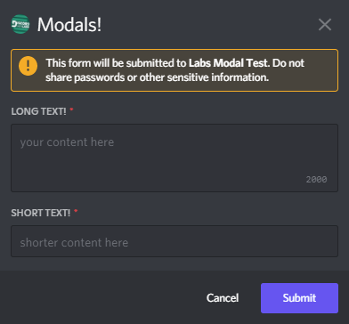
[!WARNING]
Text input components can only be used in
modals.
Text input components are a type of MessageComponents that can only be
used in modals. Texts inputs can be longer (the Paragraph) style or
shorter (the Short style). Text inputs have a variable min and max
length.
Creating text inputs
Text input components can be built using the TextInputBuilder.
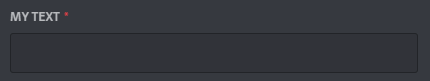
The simplest text input can built with:
var tb = new TextInputBuilder()
    .WithLabel("My Text")
    .WithCustomId("text_input");
and would produce a component that looks like:
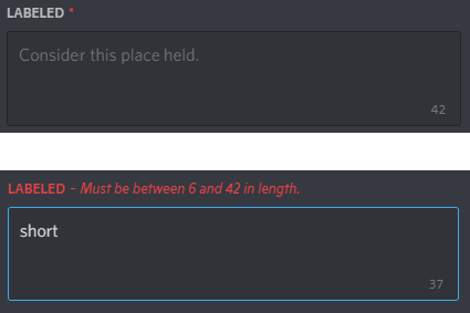
Additional options can be specified to control the placeholder, style,
and min/max length of the input:
var tb = new TextInputBuilder()
    .WithLabel("Labeled")
    .WithCustomId("text_input")
	.WithStyle(TextInputStyle.Paragraph)
	.WithMinLength(6);
	.WithMaxLength(42)
	.WithRequired(true)
	.WithPlaceholder("Consider this place held.");